The House Beautiful predictions for Colour of the Year 2026 has got us talking here at Impact Furniture. Having read, digested and discussed it we have put together some of our favourite combinations of products and colours so you can get next year’s trends this weekend- no time machine needed.
Without further to do here are the colours of the year 2026 and what we’d match them with from Impact Furniture.
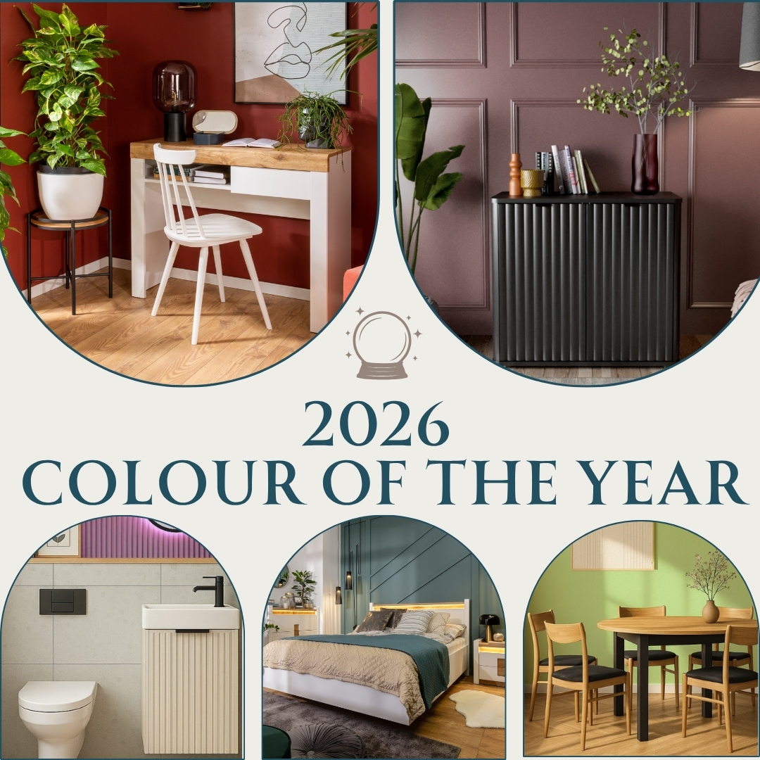
This is a nearly black with brown/metallic tones – the Paint and Paper Library’s “Bronze” is the closest current choice. It has all the style of sheer black with more nuance – perfect for a high-drama feature wall.
We think it would pair beautifully with a stunning Adel Black Fluted bathroom furniture set – the bronze wall softens the starker lines of the furniture, while the gold touches of the handles and tap tie the whole together for a perfect modern bathroom.
A muted red-orange with a tactile look (perfect to combine with limewash paint for a tactile feel too) Dunelm’s “Churchgate” is the best option out there.
This gorgeous warm hue would be superb to bring some Italian autumn-evening warmth to a bathroom or cloakroom. Especially lovely combined here with a stark black fluted sink and a round feature mirror as in this set up with our Nero bathroom vanity.
A clear sky on a summers day – this is a peaceful calming colour, perfect to brighten up a darker room – Lick’s “Blue” is spot-on.
Our choice is matching it with monochrome art, wood frames and a beautiful Indus Oak effect and Black round extendable table. This lovely light blue really lifts the starker lines and heft of this darker furniture.
Nothing says homely quite like this gorgeous deep plum a complete renunciation of “Greige”. It is perfect for a feature wall or to zone a room, and would look stunning paired with some greens in a Cottagecore setting – we love Graham & Brown’s “Damson in Distress”.
We’d pair this with some classic panelling and our stunning and sleek Nuvo Black Fluted sideboard. We’ll pair it with a very different colour later for a more modern setting.
A wonderful nature inspired colour to add some depth and character to any space from a bedroom to a bathroom, but why not branch out and consider it for a kitchen, we love Abigail Ahern’s “Kelp Harbour“.
In terms of pairing it works beautifully with any white bathroom or kitchen but our top pick is the Ella White Gloss Full kitchen, where oak backdrop, worktop and plants strengthen that link to nature.
This is a wonderful deep pink ideal for a dressing room or en suite. Our pick is Farrow and Balls “Sulking Room Pink”.
This warm tone pairs best with a starker set up, here we have gone with a Masy White Gloss Extendable dining table, some vertical wall panelling and a feature clock for a contemporary take on a retro set-up.

This deep midnight Black is going to overwhelm a small space or if used too heavily, however as a spot-colour or on a feature wall it is a great way to add nuance and depth to a space. Our favourite black paint is Dulux’s “Ravens Flight”.
We’ve combined this with one of our Luxury feature bedroom furniture ranges. The Black walls work beautiful with the black headboard and drawer fronts of the Kassel bedroom range giving a cosy feel with plentiful cushions and throws.
Yellow can be a bit much for some people, but this deep mustard yellow can surely convince even the most sceptical. Adding warmth to a dark room or some year round sunshine painted around window frames there is a space and a spot for Lick’s “Yellow” in any home.
This is perfect for creating a more modern feel combined with the Nuvo small Black Fluted sideboard, modern prints and curated books.
A deeper more grown-up blue perfect for a moodier space. Whether a fireplace alcove or a whole study this colour gives a calming and joyful feel. Dulux’s “Boathouse Blue” is our top pick here; it’s dreamy hue is perfect for any space.
If something is worth doing, its worth doing twice. We love this combo of blue painted walls paired with matching textured blue hexagonal tiles as a perfect foil to bring out the bluey-grey tones in our Star Grey Gloss kitchen cabinet sets.
You might think white is white is white, but that is not the case. Creamy White is about moving away from renters white to something a little more homely. Taking it’s inspiration from more natural tones (think linen and chalk) we’d recommend Graphenstone’s “White Linen”
This a perfect paint to freshen up a space quickly, paired with natural fabric rugs, wood toned and black furniture and plenty of sunlight it looks stunning with our Kiznie Oak and Black TV Cabinet.
Even light Teal is a beautiful bold tone; use this to add some instant character to a room. Teal is perfect for tapping into a Boho style, we love Benjamin Moore’s “Aegean Teal”.
This punchy colour works best with neutral furniture options. Here a White Gloss and Oak effect Alameda bedroom furniture is the perfect counterfoil to the quirky and contemporary teal wall panelling – a wonderful example of modern day Bohemian style.

We are in amongst the bold colour options now, but you can take Magenta brighter or darker as you like. Use a darker Magenta sparingly to add character to a feature wall or nook. For an audacious touch use on trims or ceilings to make a space cosier. Our top choice is B&Q’s “Himonya” a luscious vibrant tone to add some whimsy to your home.
Like teal this pairs best with some neutral furniture to avoid overwhelming a space. We’ve steered away from the stark white though with this tone and opted instead for a Cashmere Beige Ribbed vanity with oak shelf and frame in this modern magenta panelled en suite bathroom.
Does anything say luxury quite like Gold? Deep golden walls, stylish panelling and plush velvet upholstery adds instantaneous indulgence. We love Dulux’s “Brushed Gold” for an extravagant feel.
You can be savvy with gold to add opulence. We love the way that this Cara herringbone bathroom cabinet set has gold taps, handles and wall shelves. These accents pair beautifully with golden lights to bring out the rich deep tones of the marble wall tiles. A great example of how to make a space feel lavish with simple little touches.
Green is always popular although Sage has been done to death. A warm green can bring all the benefits (calming, neutral and soothing) while bringing a freshness and stylish touch. Keen to add some warm green tones to your home, we’d recommend Dunelm’s “Soft Catkin”.
Here the warm green tones are exaggerated by tactile woollen artwork, wood tones, a pared back floral arrangement in a turned wooden vase and a gorgeous Indus Oak and Black effect round extendable dining table to add a touch of contrast.
Well hopefully that’s got you excited for next years trends. We cannot wait to see what the pantone colour of the year 2026 is going to be. (Though we reckon it’s got to be on this list).
Already living in 2026? Or keen to set up your Pinterest board to plan out that living room renovation you had on the cards?


Impact Furniture customers can save 20% off their first EASEFIX installation with code impact20


Web Design by Make Us Visible


 RATED EXCELLENT!
 24 MONTH WARRANTY
 30 DAYS RETURN


